frame
Arrow down
frame
frame
frame
frame
About
Yan
Luk

Experience


Jun 2023 –
Lane Crawford (Hong Kong) Ltd
Front-End Developer
Delivered 20+ interactive landing pages on schedule.
Led UX audits with vendors to improve usability.
Managed project timelines to ensure timely delivery.

Jun 2020 – May 2023
Lane Crawford (Hong Kong) Ltd
Front-End Designer / Developer
Built responsive HTML templates in Emarsys, boosting Sale eDM clicks by 33%.
Collaborated on automated email campaigns for sales optimization.
Designed 270+ eDM, SMS, MMS, and WhatsApp campaigns for key events.

Apr 2022 – Apr 2024
Proche Ltd
Part-Time Designer
Developed SEO-friendly WordPress eCommerce sites.
Automated reservation workflows, improving efficiency.
Trained non-technical staff to independently build and maintain websites.

Mar 2018 - May 2020
Hong Kong Economic Times Holdings Ltd.
Full Time Web Designer
Created assets for 100+ marketing campaigns.
Built landing pages and Emarsys templates for promotions.
Supported marketing with engaging visual designs.

Profile


Dynamic Web & Project Management Professional with 7+ years of experience leading and delivering end-to-end web projects. Proven track record in web design, front-end development, and cross-functional project coordination, from planning to execution. Skilled in creating responsive and user-focused websites with a strong focus on UX/UI optimization and performance.

Profile

Dynamic Web & Project Management Professional with 7+ years of experience leading and delivering end-to-end web projects. Proven track record in web design, front-end development, and cross-functional project coordination, from planning to execution. Skilled in creating responsive and user-focused websites with a strong focus on UX/UI optimization and performance.

Jun 2023 –
Lane Crawford (Hong Kong) Ltd
Front-End Developer

Delivered 20+ interactive landing pages on schedule.
Led UX audits with vendors to improve usability.
Managed project timelines to ensure timely delivery.
Jun 2020 – May 2023
Lane Crawford (Hong Kong) Ltd
Front-End Designer

Built responsive HTML templates in Emarsys, boosting Sale eDM clicks by 33%.
Collaborated on automated email campaigns for sales optimization.
Designed 270+ eDM, SMS, MMS, and WhatsApp campaigns for key events.
Apr 2022 – Apr 2024
Proche Ltd
Part-Time Designer

Developed SEO-friendly WordPress eCommerce sites.
Automated reservation workflows, improving efficiency.
Trained non-technical staff to independently build and maintain websites.
Mar 2018 – May 2020
Hong Kong Economic Times Holdings Ltd.
Front-End Designer / Developer

Created assets for 100+ marketing campaigns.
Built landing pages and Emarsys templates for promotions.
Supported marketing with engaging visual designs.
frame
frame
frame
frame
frame
frame
frame
frame
frame
frame
frame
Works

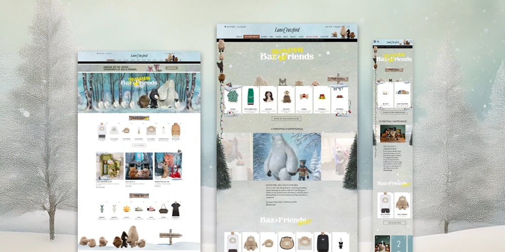
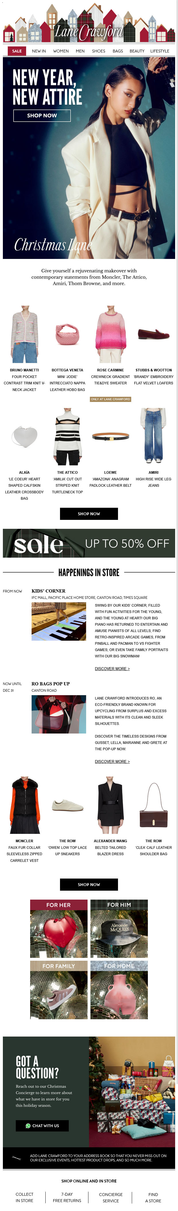
Crafting Holiday Wonder: The Making of Lane Crawford’s Christmas Landing Experience

2024 @ Lane Crawford

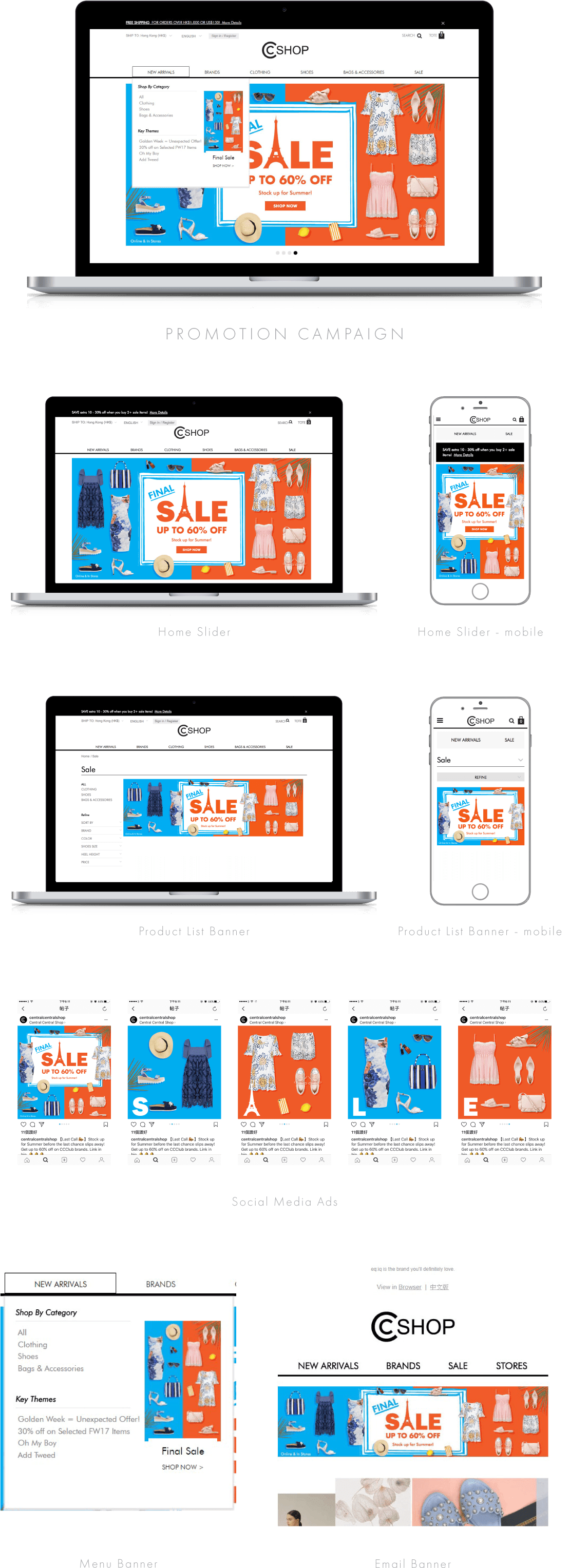
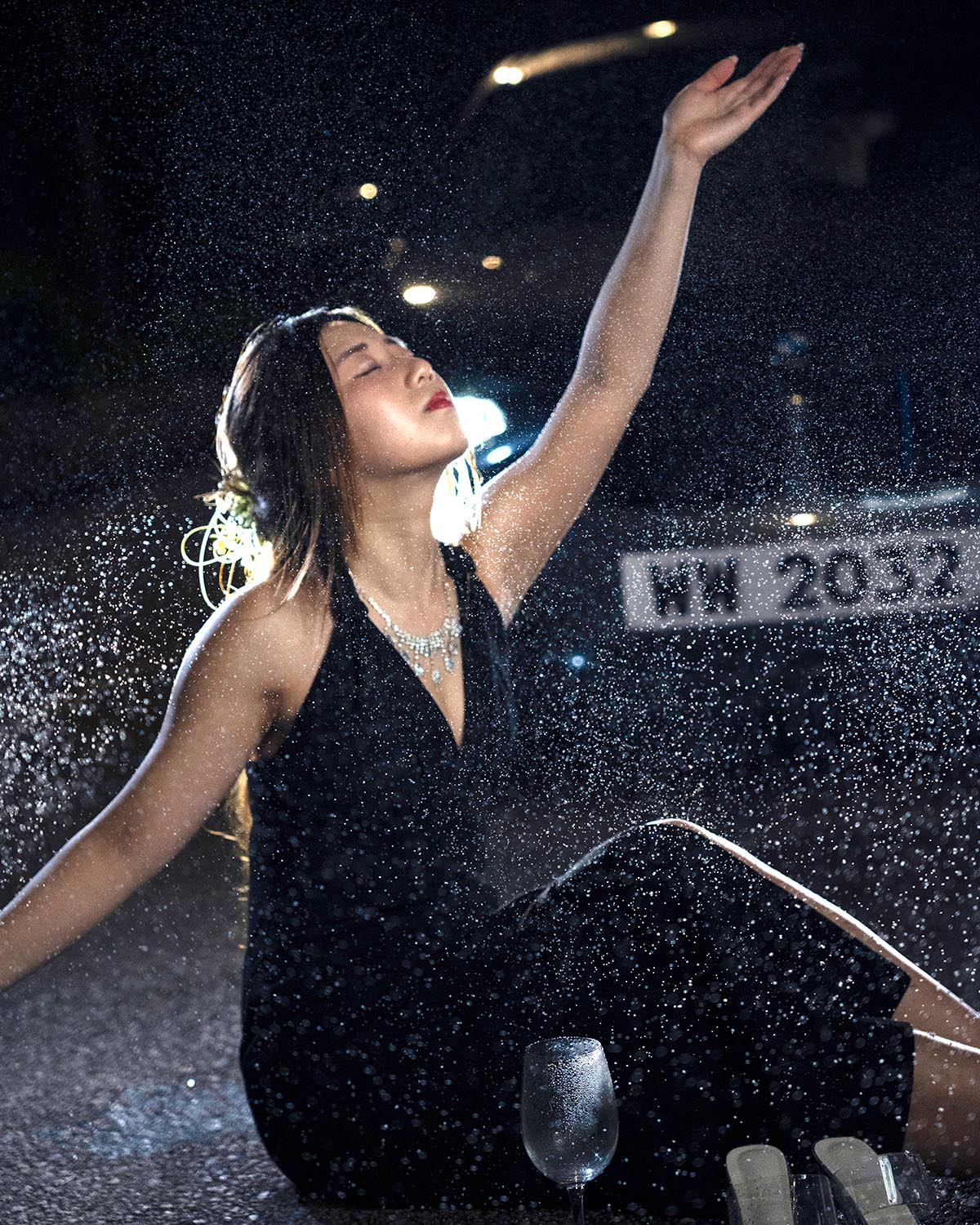
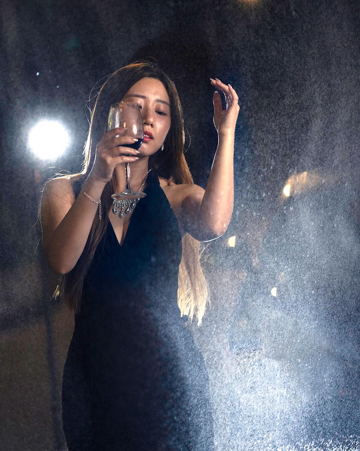
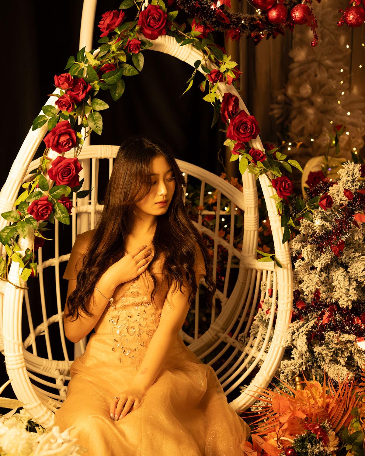
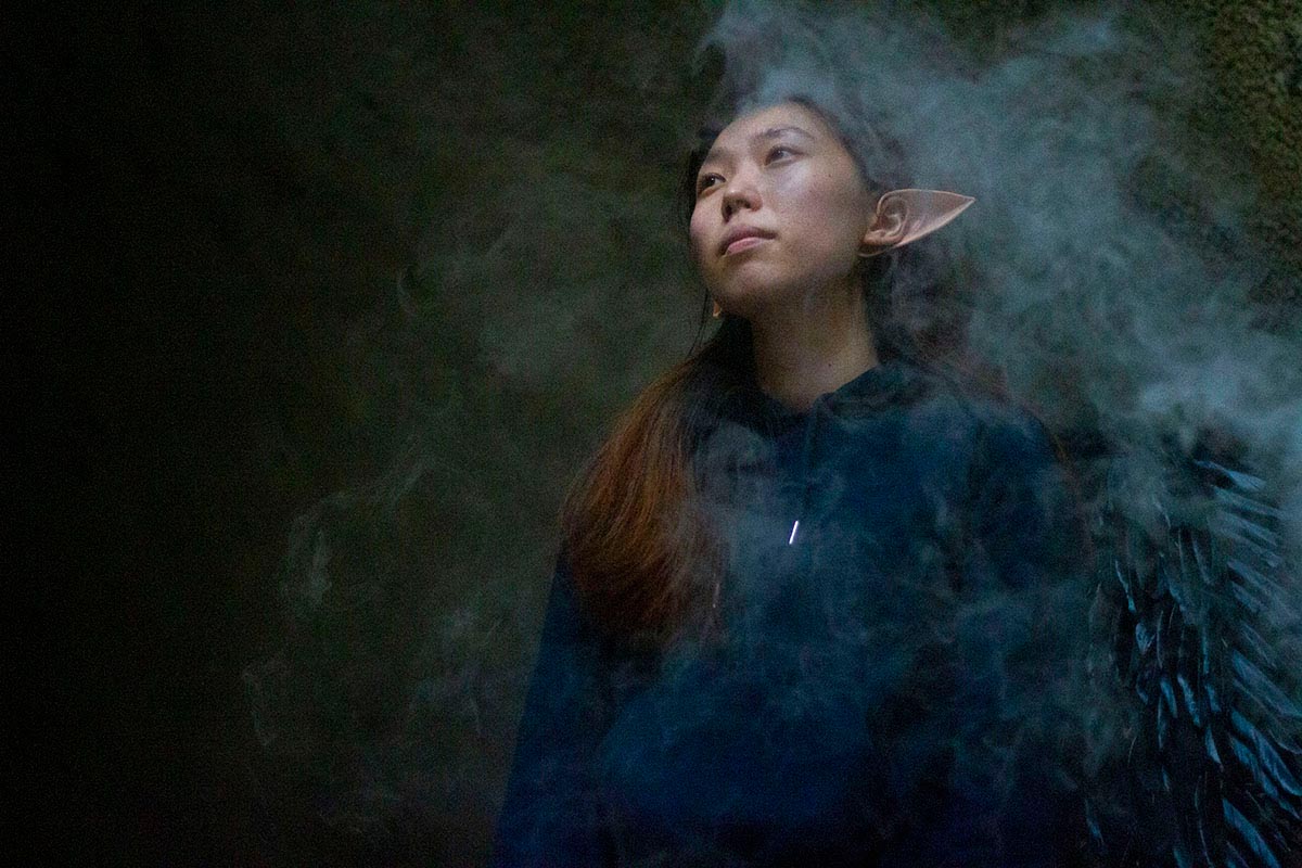
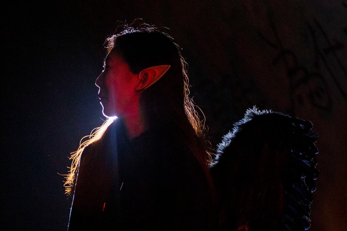
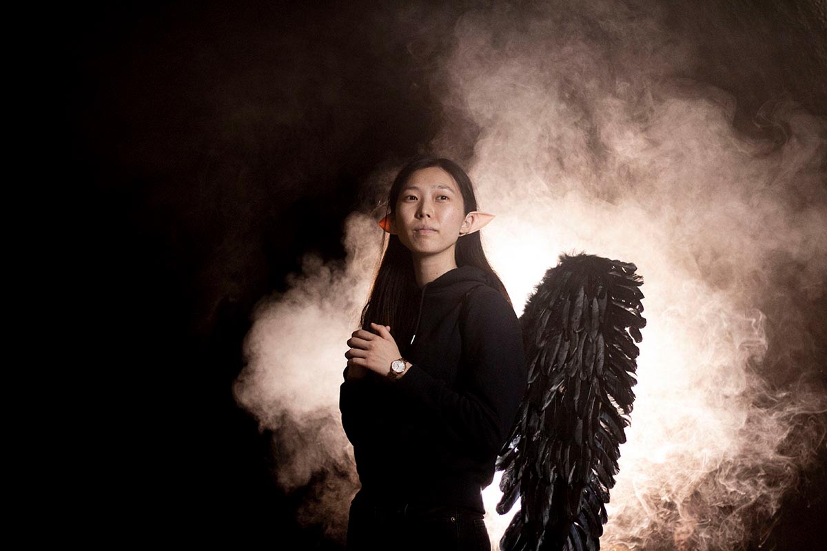
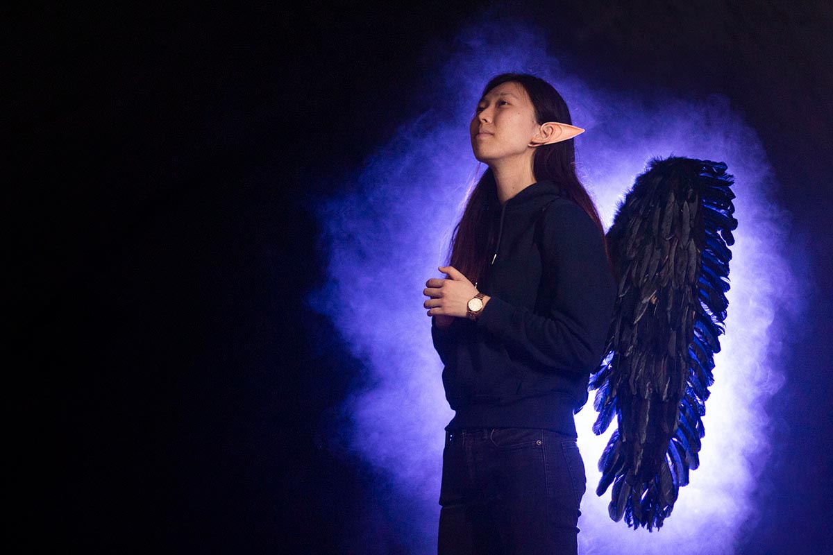
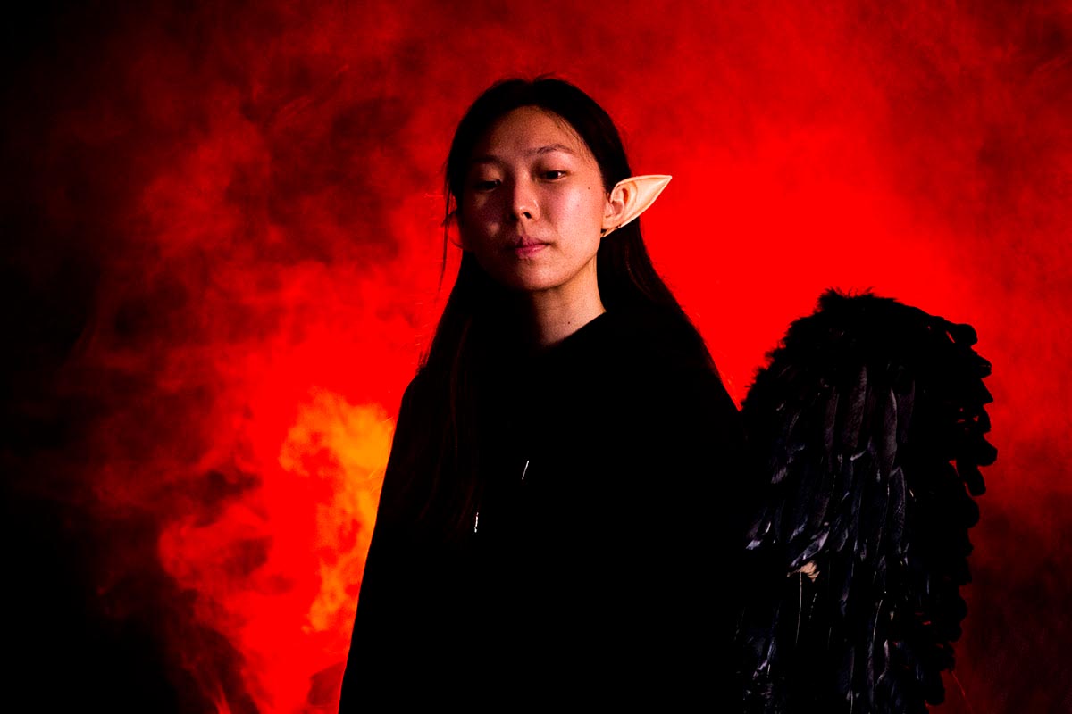
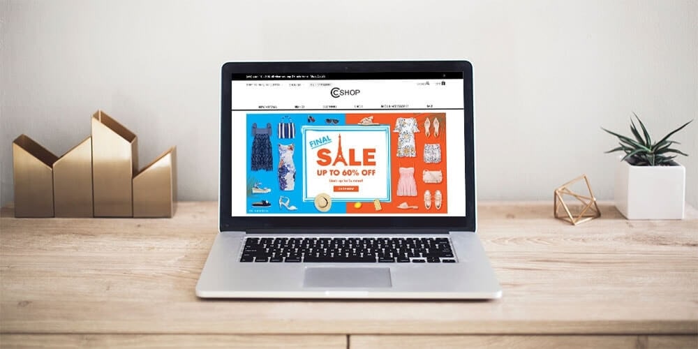
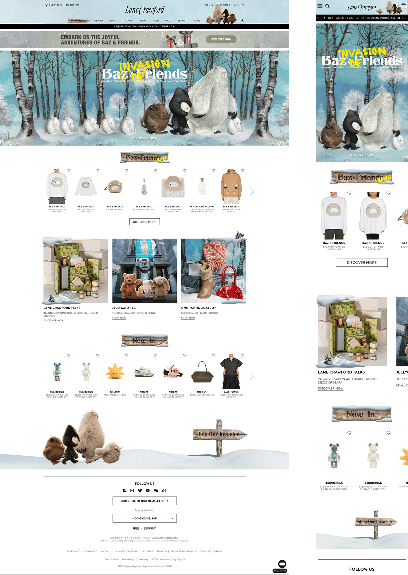
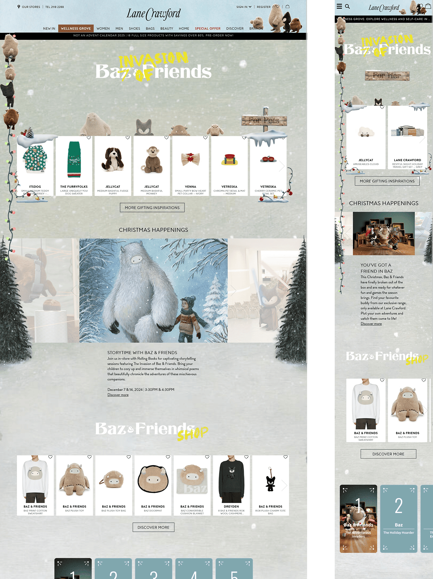
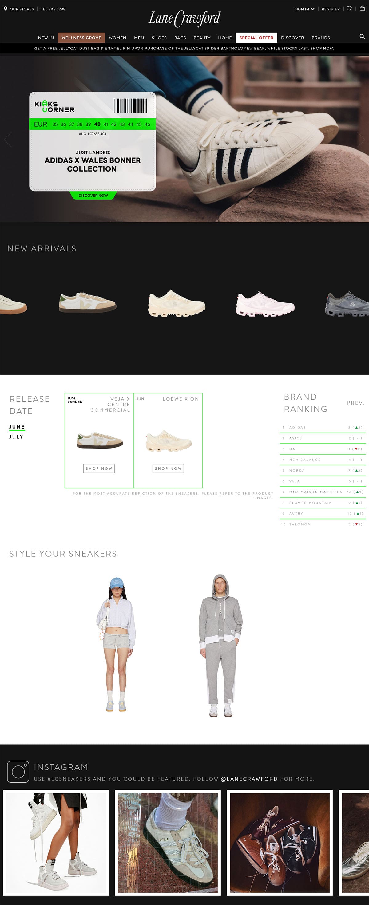
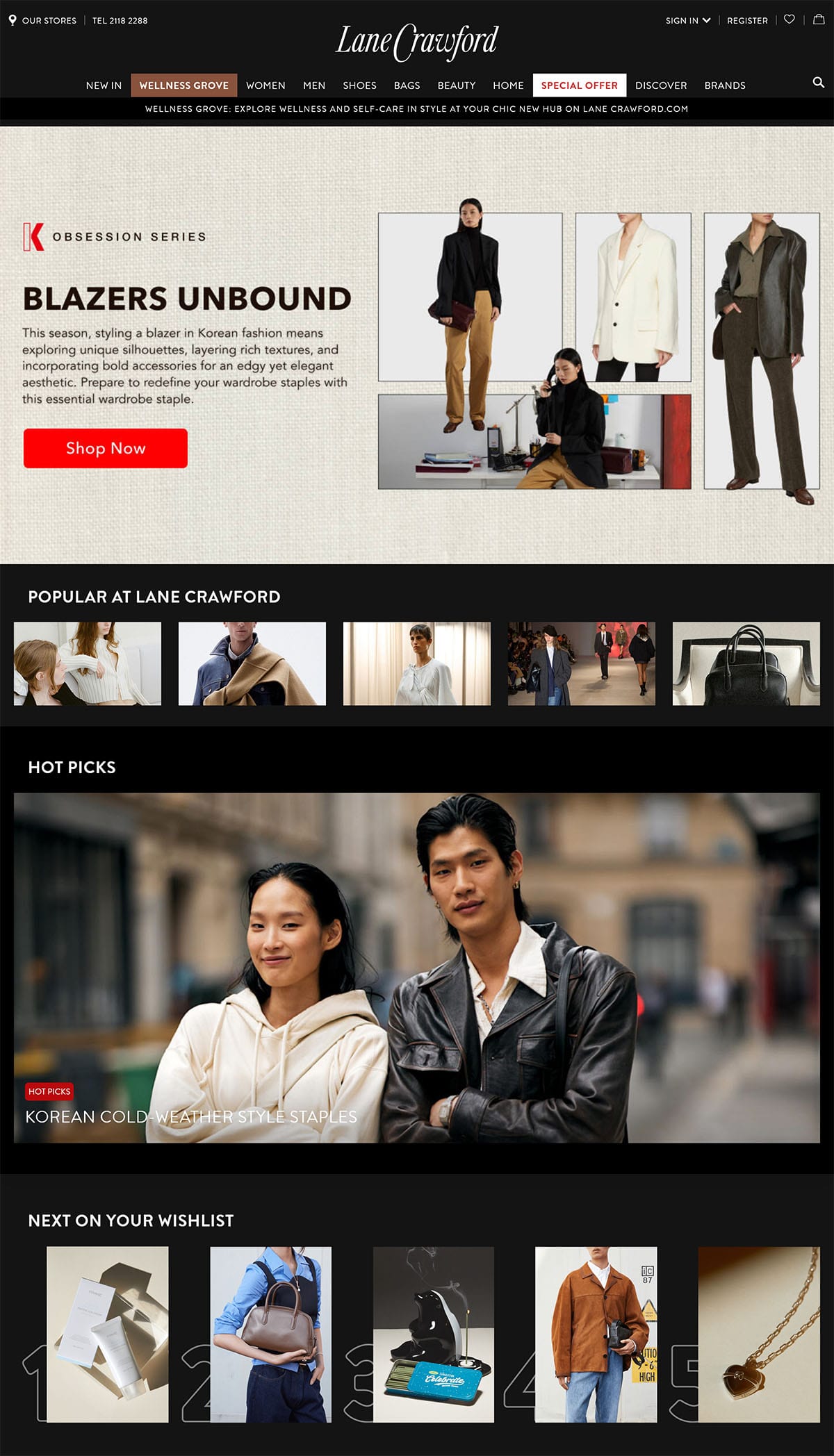
The holiday season is never just about shopping — it’s about memories, stories, and a touch of wonder. As part of my role at Lane Crawford, I helped shape the Christmas 2024 campaign into more than a landing page. I wanted to craft a stage where storytelling, fashion, and interactivity could all come to life.

Turning a Campaign Into an Experience

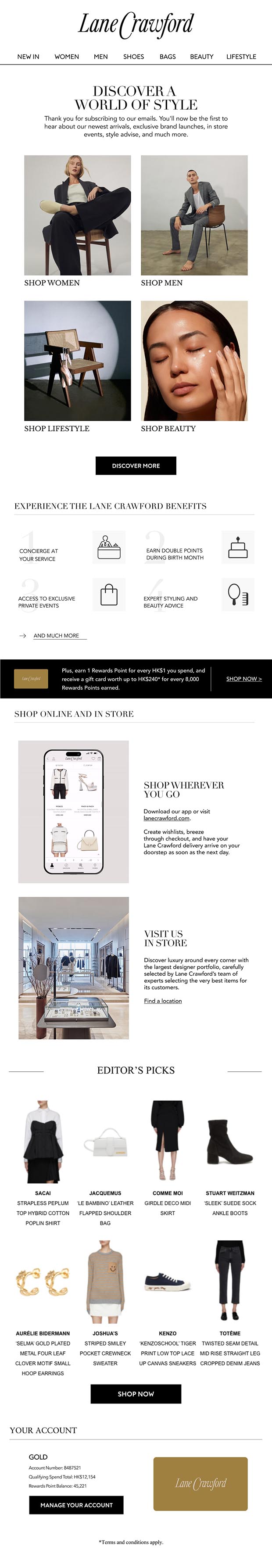
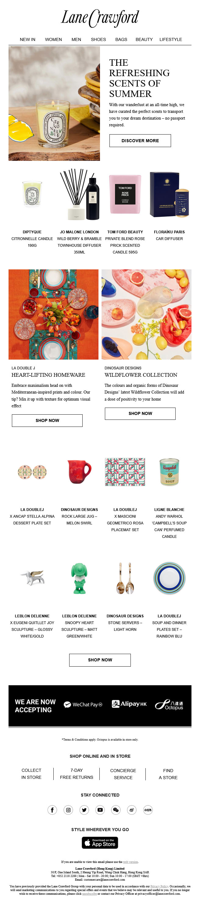
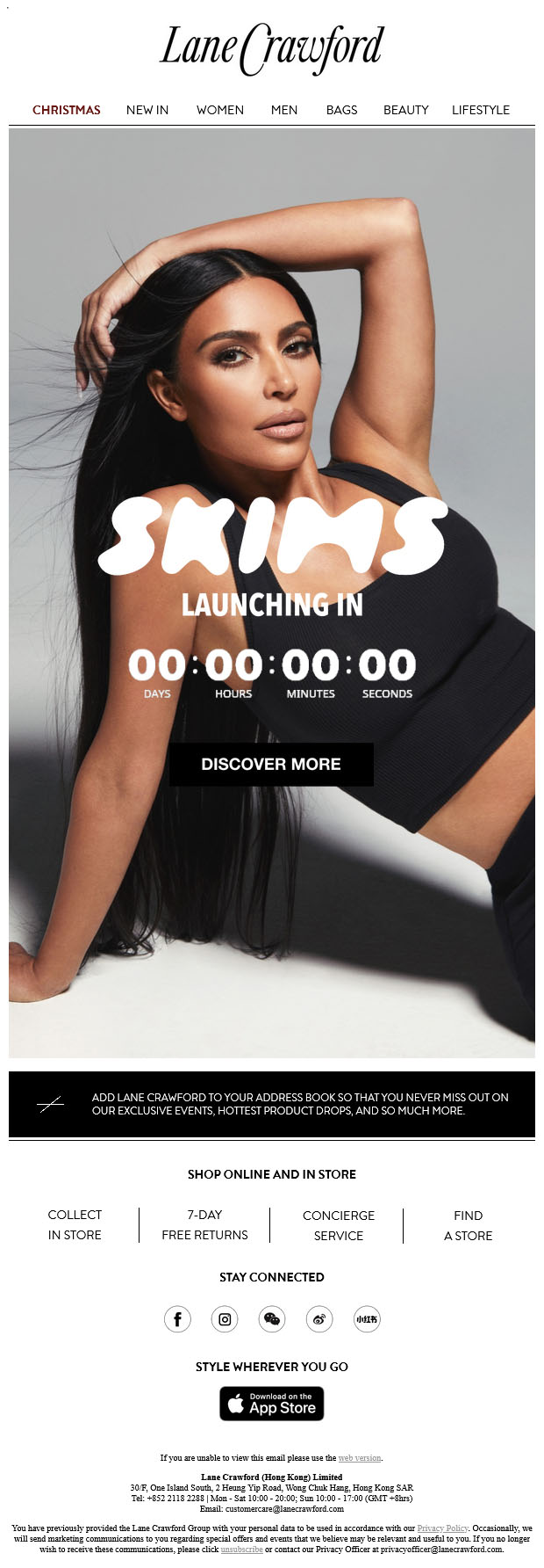
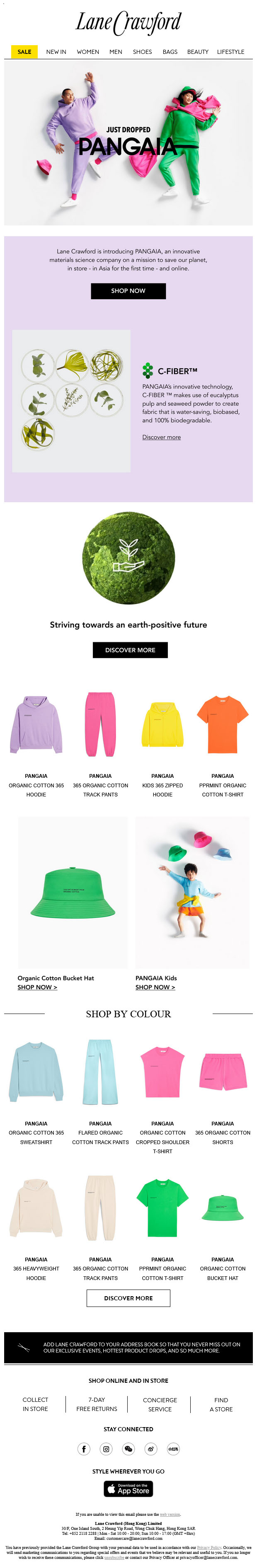
This project brought together storytelling, brand identity, and a seamless e-commerce experience in a festive, interactive environment.

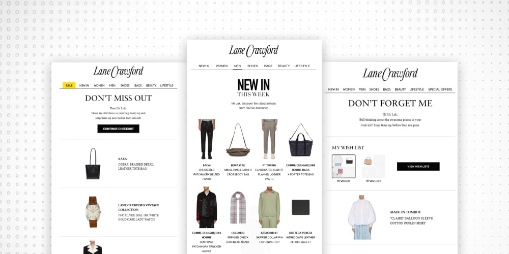
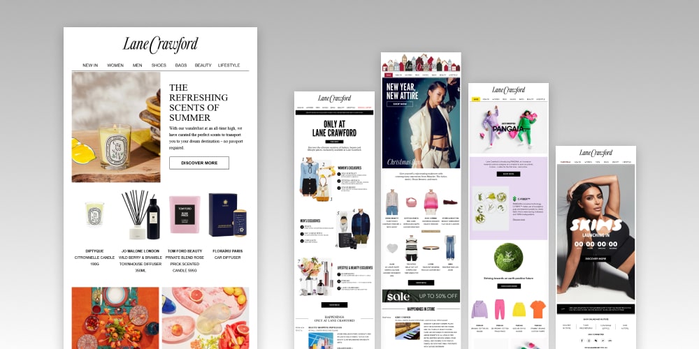
The campaign introduced 4 little buddies — Baz, Mini Baz, Rox, and Max — to guide customers through seasonal offers, events, and gifting. The goal was to create a dynamic, immersive page that not only captured the festive spirit but also inspired exploration across Lane Crawford’s luxury categories.

So I did what any front-end developer does best: I stitched together assets, design, and code until the story could breathe online.

My Role in the Project

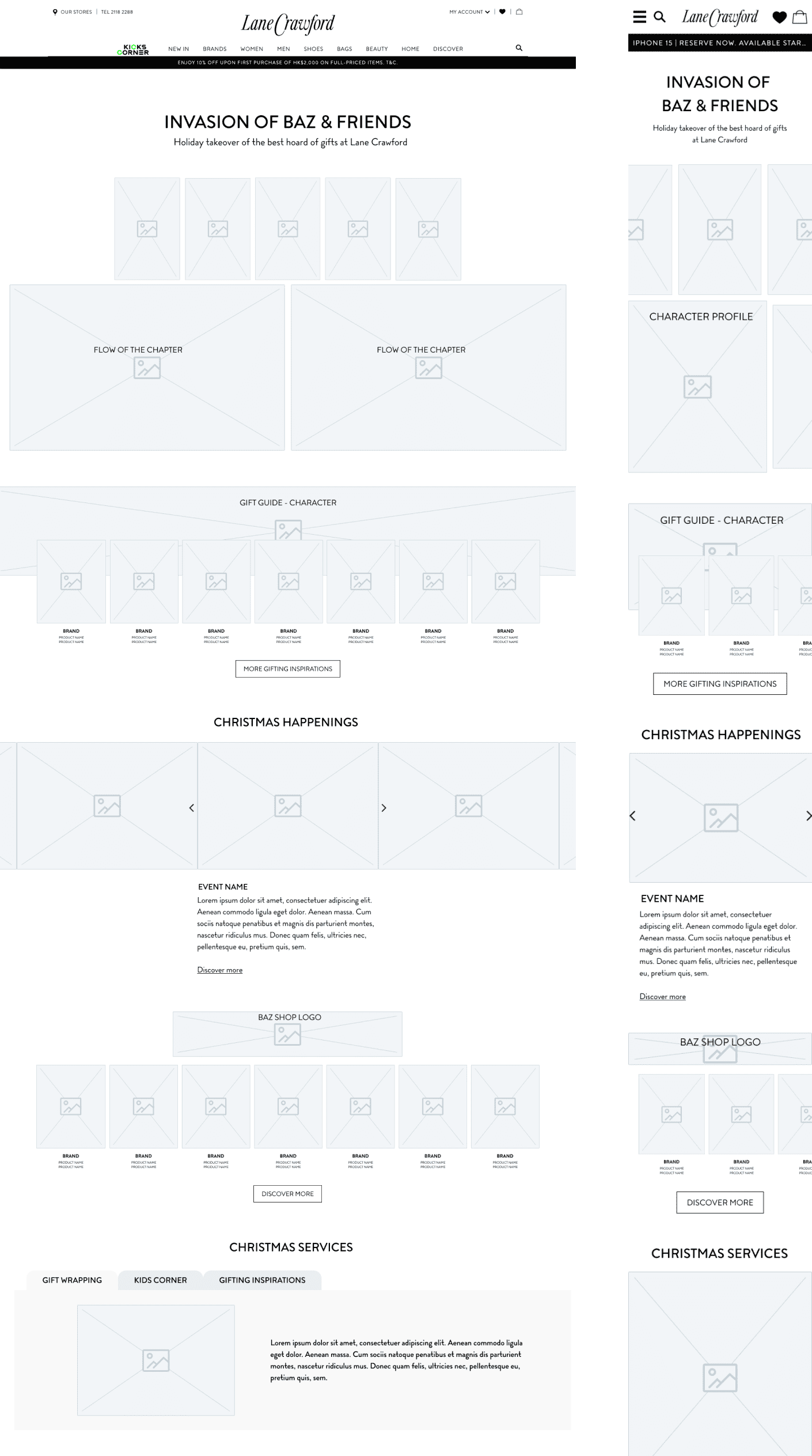
  • Front-End Build: Structured the Christmas landing page with campaign specific CSS for a festive yet consistent design.
  • Interactive Features: Integrated custom JavaScript modules to animate characters and create smooth festive interactions.
  • Performance Focus: Balanced creativity and site speed by aligning with Lane Crawford’s established technical standards.
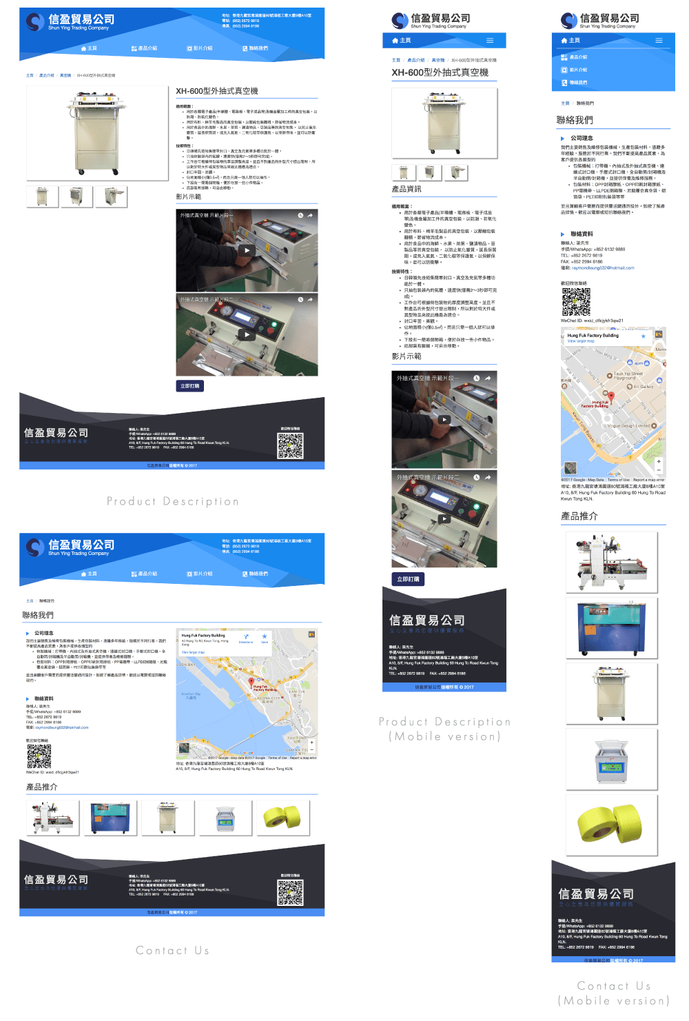
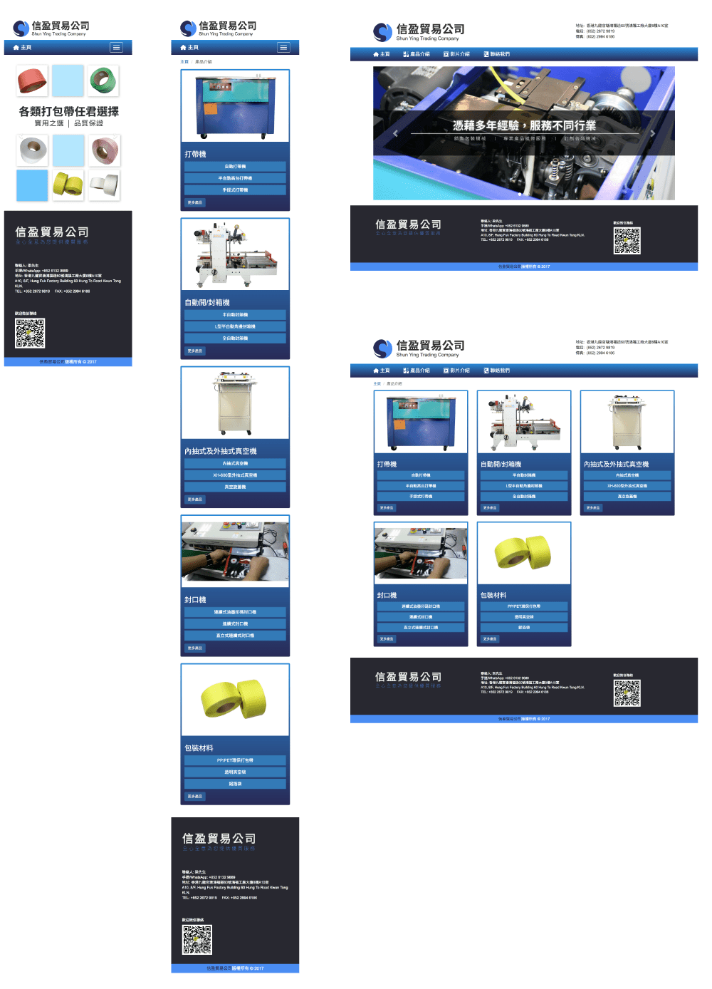
  • Wireframe & User Flow: Planned and mapped how users would explore the campaign, from first arrival through events highlights to exclusive shopping edits, ensuring a logical and enjoyable journey.

What I Learned

Projects like this remind me that front-end development is equal parts stage design and storytelling. It isn’t just pixels and breakpoints — it’s how you make someone feel when they land on a site. And in this case, that feeling was a little bit of holiday magic.

Credits and stack

  • Role: Web developer (wireframing & user flow, responsive build, performance, accessibility, motion)
  • Deliverables: Christmas homepage, landing page, gift guide & sitewide header
  • Focus areas: Responsive layout, accessibility, micro-interactions, editorial content structure
Christmas Homepage

Christmas Homepage

Christmas Landing

Christmas Landing

Christmas Wireframe

Christmas Landing Wireframe

Playful Shopping: Three Mini Games I Built for Lane Crawford with GSAP

For a seasonal trio at Lane Crawford—Chinese New Year, Valentine’s Day, and a New Year composition—I set out to make shopping feel playful and personal. Each editorial page hid a tiny game that moved readers from story to products through touch, motion, and small moments of delight.

Why GSAP was the backbone

I used GSAP to design how things move and respond. Timelines gave me a single source of truth for intros, interactions, and reveals. Plugins like Draggable, Inertia style motion, and MotionPath let me focus on the “weight” and personality of each interaction rather than polyfills and math.

Spin the Wheel (New Year)

A celebratory wheel that feels alive. You swipe, it glides with a sense of weight, slows, and lands with a soft bounce on your “style fortune.” A title reveals, and product picks slide in. One clean arc: a hint of suspense, a warm reveal, and an easy try again.

See the Pen CNY Spinning by Yan Yan Luk (@Yan-Yan-Luk-the-encoder) on CodePen.

Spin the Wheel for Your 2025 Style Inspo

Create Your Own New Year (Chinese New Year)

Think stickers on a red packet. You place symbolic stickers onto a red packet canvas, arranging your wish for the year. Pieces snap neatly into place, so your design feels layered and intentional. When you’re happy, a quick celebration lights up your layout—and you can download your creation to keep. I used dom-to-image.min.js to capture the red packet canvas and export it as an image, turning play into a takeaway.

See the Pen CNY laisee by Yan Yan Luk (@Yan-Yan-Luk-the-encoder) on CodePen.

Create Your Own New Year

Charm Your Way (Valentine’s Day)

Following the positive feedback from our "Create Your Own New Year" experience, here we have a similar concept but more impressive game for Valentine’s Day - select your favorite charms and start embellishing your bag! Simply drag the bag charms from the left onto the bag on the right to mix and match. Once you're done, you'll be directed to a curated selection of bags and bag charms from Shoptab.

See the Pen Charm Your Way Through the Month of Love by Yan Yan Luk (@Yan-Yan-Luk-the-encoder) on CodePen.

Charm Your Way Through the Month of Love

Impact

We saw longer dwell times and smoother paths into curated products. More importantly, the editorial narrative and the shopping journey finally spoke the same language. These pages gave the brand a reusable motion system we can remix for future campaigns.

Credits and stack

  • Role: Web developer (motion, performance, accessibility)
  • Deliverables: interactive and reuseable modules, performance optimization
  • Focus areas: interactions, creativity

From Hype to Harmony: Designing Three Landing Pages That Move With Culture

2024 - 2025 @ Lane Crawford

When I joined Lane Crawford’s digital team, the brief was clear but ambitious: craft special landing pages that capture—and convert—the cultural currents shaping how people shop. The result was a three-part series of content-driven experiences that wrapped product discovery in a story-first, scroll-native design:

  • Wellness Grove — a quiet pause for mindful retail
  • Kicks Corner — a sneakerhead’s seasonal playground
  • K-Obsession — a K-culture spotlight

Together, they formed one narrative: the modern customer isn’t just buying things—they’re joining movements. My job was to translate movement into motion on the web.

What I built

  • Narrative-led landing pages: Each page opens with a hero that sets the mood, then flows into editorial modules and shoppable sections. The content reads like a magazine but behaves like a store.
  • Mobile-first layouts: I designed for thumbs first—card stacks, swipe-friendly galleries, compressed media, and lazy-loading for speed.
  • Micro-interactions: Subtle transitions, hover states, and scroll reveals created a tactile sense of craft without slowing performance.

The design system underneath

Under the hood, I created a shared type scale and spacing system that could flex from energetic (K-Obsession) to contemplative (Wellness Grove) without breaking the brand. Performance was treated as a feature: responsive image sets, lazy-loading, minimized blocking scripts, and CSS-driven motion kept Core Web Vitals healthy.

Crafting the journey

My contribution centered on the wireframe and build: shaping the flow from thesis to product so the pages read like editorial but convert like commerce. Each page opens with a clear “why now,” then graduates into progressively detailed sections. Skimmers see the essentials—headlines and hero products—while deep divers uncover editor notes, brand context, and layered galleries. I designed the rhythm to feel natural: browse, learn, want, act. The component structure supports both quick scans and long reads, making seasonal refreshes fast without rethinking the journey each time.

Credits and stack

  • Role: Web developer (wireframing, responsive build, performance, motion)
  • Deliverables: Three themed landing pages, component library, performance optimization
  • Focus areas: Responsive layout, accessibility, micro-interactions, editorial content structure

From Zero to Launch: How I Shipped Three High Traffic WordPress Sites End to End

2022 - 2024 @ Proche

Building a beautiful website is one thing. Turning it into a fast, secure, and resilient product that real customers trust is another. In a startup environment, I owned the full stack for three very different brands — UK University, Pet Travel, and Match Dating — from hosting and infrastructure to performance, SEO, and day to day publishing. Here’s the story behind shipping all three, end to end.

Three brands, one stack, many constraints

Startups move fast and budgets are real. I needed a repeatable setup that balanced reliability with speed of delivery. The answer: a hardened WordPress stack on cPanel hosting, fronted by Cloudflare, and optimized with a battle tested theme and a lean plugin toolkit. The result was three distinct sites — UK University, Pet Travel, and Match Dating — each with its own voice, yet sharing the same performance and security DNA.

TL;DR

Three production sites, launched and maintained on a scalable, secure WordPress stack:

  • Hosting and ops via cPanel
  • Full SSL coverage
  • Cloudflare CDN, caching, DDoS, and WAF
  • WordPress with Flatsome and WooCommerce
  • Performance via WP Rocket and careful asset strategy
  • Conversion with Fluent Forms and Buttonizer
  • SEO foundation with Yoast and structured content
  • Safe deployments with All in One WP Migration

Owning the infrastructure, not just the theme

I started at the bottom of the stack. Servers were set up with cPanel to streamline operations and facilitate handover. I issued and renewed SSL across domains and subdomains so every touchpoint was encrypted. Cloudflare sat at the edge for global CDN, smart caching, and DDoS protection, which gave us instant gains in latency and resilience.

A WordPress foundation that scales with content

For the front end, I chose the Flatsome theme—not for the buzzword, but for its balance of flexibility and performance. It allowed me to iterate quickly on design systems while staying lightweight. WooCommerce was integrated where productized services and payments made sense, but I kept the store footprint minimal to avoid bloat. I used All in One WP Migration to version and move environments safely, so I could test aggressively without risking production.

Speed as a feature, not an afterthought

On each site, I treated speed as a UX feature. WP Rocket handled page caching, preloading, and minification, while Cloudflare’s edge cached assets close to users. I audited render blocking resources, deferred non critical JS, and optimized media delivery so first contentful paint felt snappy even on mobile.

Forms that convert and flows that feel human

Every lead form was designed to be fast and frictionless. Fluent Forms & WP Forms powered multi step flows, conditional logic, and spam prevention without wrecking performance. Buttonizer allowed me to highlight high-intent actions, such as WhatsApp, right where users needed them — particularly on mobile.

SEO that compounds

Yoast SEO set the foundation, but the real gains came from structure and intent. I built clear information architectures—services, countries, FAQs—for Pet Travel; program ladders and eligibility content for UK University; and credibility first pages for Match Dating. Clean slugs and internal linking supported discoverability. Faster pages improved crawl efficiency, while consistent on page patterns made the content legible to both users and search engines.

Credits and stack

  • Role: Web developer & UI designer
  • Deliverables: reusable UI components, fast pages, secure deployment
  • Focus areas: performance, accessibility, conversion
  • Stack: WordPress (Flatsome), Cloudflare, WP Rocket, Fluent Forms, Yoast, cPanel

Pet Travel & Match Dating:
Automating Booking Workflows for Seamless User Experiences

2022 - 2024 @ Proche

Building products at a startup means wearing many hats: designer, developer, project manager and, most importantly, problem solver. Two projects I helped ship — a pet relocation quote flow for Pet Travel and a booking system for Match Dating — were small in scope but heavy in impact. Both started with simple, manual processes that slowed teams down and created friction for customers. My role was to automate processes that reduced repetitive work, minimized errors, and enhanced the customer journey.

Pet Travel: turning a long form into an intelligent quoting engine

The original process relied on traditional paper forms, which backend staff transcribed into spreadsheets. They manually calculated crate sizes and crafted bespoke quotes. While the form was comprehensive (it had to be), it delayed responses and introduced avoidable errors.

Pet Travel Form

Pet Travel Form

I redesigned the workflow using Fluent Forms on WordPress to collect detailed trip and pet information. Submissions flowed directly into a structured Google Sheet, which served as both a datastore and a calculation engine. Using Apps Script and carefully designed formulas, each submission instantly generates a baseline quote. At this stage, the business could contact the customer with a ready-to-go quotation.

Google Sheet

^ Adding a UI button in Google Sheets to generate a quotation with a single click

Google Script

^ Using Google Apps Script to duplicate an empty quotation, fill in the customer's information, and save it in the destination folder

To close the loop and deliver an e-commerce-ready solution, I developed a standalone crate calculation and purchase page. Once customers confirmed their details and selected the recommended crate, the page instantly calculated the appropriate size and price, guiding them through checkout.

Match Dating: a polished booking loop with zero double-bookings

The match-dating product needed an elegant, reliable booking workflow. We used Calendly for bookings because it offers a smooth, low-friction scheduling interface customers already trust. But booking is just the start: the team needed automated confirmations, SMS reminders, and protection against double-bookings across shared availability.

Match Dating Calendly

Match Dating Booking System

I built an integration layer using Zapier that acted as the glue. When someone booked via Calendly, Zapier triggered a sequence: an email confirmation was sent, an SMS reminder dispatched, and the customer’s appointment was written to a centralized Google Calendar. To prevent accidental double-bookings, Calendly also wrote a blocking event into the calendar or adjusted availability dynamically, depending on the team’s configuration.

Match Dating Email

Email notification

The impact

  • Drastically reduced manual processing time for quotes and bookings.
  • Increased response and conversions by letting customers complete a simple calculation form, then presenting relevant purchasable crate options.
  • Reduced no-shows and scheduling errors with automated confirmations, SMS reminders, and calendar blocking.

Design choices and trade-offs

I favored simple, reliable, low-code tools (Fluent Forms, Google Sheets, Calendly, Zapier, WooCommerce) so non-engineering staff could maintain and iterate the flows. That made the systems fast to ship, easy to debug, and visible to stakeholders. The trade-off is that deeply custom or high-scale workflows will eventually benefit from a dedicated backend — but for the startup phase this approach delivered rapid, low-cost impact.

Credits and stack

  • Role: Product designer & developer (UI, automation)
  • Deliverables: end-to-end UX (quote → cart), reusable components, automated pricing calculations, scheduling automation and reminders, accessibility and performance tuning
  • Focus areas: interaction design, conversion optimization, reliability, creative problem solving

Building Confidence in Motion: Shun Ying Trading Company Website

2017 @ Freelance Job

When Shun Ying Trading Company, a Hong Kong business specializing in packaging machinery, approached us, they wanted something simple — a professional, reliable web presence that reflected the quality of their products. My partner Kyla Yip and I started the project from scratch, setting out to create a first version that would give the company a strong, credible digital identity.

Laying the Foundation for Trust

Our target audience consisted mainly of middle-aged business owners and factory operators, many of whom browse the web on their mobile phones. That shaped most of our design and UX decisions. We placed mobile usability at the forefront, ensuring that navigating product details and service information would feel smooth, intuitive, and approachable.

The Role I Played

My responsibilities focused on UX design, as well as all front-end coding. From layout structure to spacing systems, my goal was to make the interface feel balanced and purposeful, no matter the screen size.

To get things moving efficiently, we built the front end using Bootstrap — giving us a strong grid system, consistent spacing, and responsive breakpoints right out of the box. It let us focus more on experience and content rather than reinventing the layout framework from scratch. Small tweaks through custom CSS helped the design stand apart from a standard Bootstrap template, keeping it clean yet unique.

Designing for Real Users

Because our audience wasn’t necessarily tech-savvy, our biggest challenge was keeping everything simple — no complex navigation, no unnecessary animation. Just clear buttons, structured sections, and strong readability. The goal was that even someone new to browsing business websites could find what they needed instantly, whether on mobile, tablet, or desktop.

For me, it was a meaningful project — one that combined practical UX design principles with the proven simplicity of Bootstrap, resulting in a product that simply works. It’s not about fancy effects or experimental interaction — it’s about delivering clarity and confidence through design.

Credits and stack

  • Role: UX Designer & Developer
  • Deliverables: Fully responsive website, Company information & product showcase pages, Desktop, Mobile and tablet optimized user experience
  • Focus areas: Bootstrap 3, HTML5 / CSS3, Adobe Photoshop & Illustrator
Shun Ying HP PLP Shun Ying PDP Contact

Shun Ying Webpage

Shun Ying Draft

Shun Ying Webpage (Draft Version)

Shun Ying Sitemap

Sitemap

Shun Ying UX Flow

UX Flow

Reinventing Luxury CRM: How I Helped Transform Lane Crawford’s Always-On Email Experience

2023 @ Lane Crawford

In the world of luxury retail, every customer touchpoint matters. During my time as an Email Developer at Lane Crawford, I had the opportunity to contribute to a major CRM communications revamp—an ambitious project that redefined how the brand connects with its customers through always-on email journeys.

This wasn’t just a design refresh. It was a full-scale transformation of over 16 automated email programs, spanning welcome journeys, loyalty tier upgrades, birthday celebrations, and personalized product recommendations. The goal? To elevate the customer experience with smarter personalization, stronger visual storytelling, and seamless integration across regions and languages.

My Role: Building the Backbone of CRM Communications

As the email developer on the project, I was responsible for:

  • Developing responsive HTML/CSS templates for over a dozen CRM programs, ensuring they works across devices and email clients
  • Implementing dynamic content blocks using Emarsys scripting to personalize emails based on customer tier, gender, region (Hong Kong, Mainland China, rest of the world), and language (TC, SC, ENG).
  • Collaborating with cross-functional teams CRM strategists and copywriters—to bring each email to life, from wireframe to launch.

Highlights from the Revamp

  • Welcome Series: A redesigned onboarding experience with icon-driven layouts, app download CTAs, and AI-powered product recommendations.
  • Tier Upgrade & Renewal: Dynamic emails that celebrated customer milestones with personalized benefits and new card visuals.
  • Birthday Program: Gender- and tier-specific offers, including beauty gifts, bonus points, and suite access—delivered with a warm, personal touch.
  • Points Reminder & Redemption: Visual hints and reward summaries to drive urgency and engagement.

The Impact

The project spanned over 6 months, involving multiple rounds of design, testing, and stakeholder reviews. By the end, we had successfully migrated all legacy templates to a new modular system. The result was a more cohesive, data-driven CRM ecosystem that aligned with Lane Crawford’s luxury brand identity.

Credits and Stack

  • Role: Email Designer
  • Deliverables: Always-on CRM emails, dynamic content logic
  • Focus areas: Personalization, engagement, conversion optimization
Old Version

Old version (designed by myself in 2020)

Welcome Email

Welcome Email

Birthday Programme

Birthday Programme

FPRP Reminder

FPRP Reminder

Intro Platinum

Upgrade & Renewal: Platinum

Intro Gold

Upgrade & Renewal: Gold

Luxury Emails That Convert: How We Automated Lifecycle Campaigns at Lane Crawford

2023 @ Lane Crawford

The project focused on three key flows: Abandoned Cart, Wishlist Reminder, and New In. Each email was crafted to speak directly to the customer at just the right moment, using dynamic content and personalized triggers to drive engagement and conversions.

Building the Experience

Luxury shoppers are intentional. They browse, curate, and often hesitate before making a purchase. Our goal was to re-engage them with subtlety and elegance.

I collaborated with Beta Labs to map behavioral triggers and build responsive HTML templates that aligned with Lane Crawford’s premium aesthetic. These templates were functional, mobile-optimized, and integrated seamlessly with the email marketing platform.

For the Abandoned Cart and Wishlist Reminder flows, we integrated Beta Labs’ API to fetch product data based on user activity. This allowed us to dynamically populate emails with the exact items users had interacted with—creating a sense of continuity and relevance that felt personal and timely.

The New-In Highlights campaign took personalization even further. Instead of generic editorial storytelling, we leveraged BetaLabs’ AI engine to generate product recommendations tailored to each user’s browsing history. These picks were algorithmically curated, ensuring that every email felt like a bespoke shopping experience.

What I Learned

This project taught me how to blend storytelling with strategy. I learned to think beyond the code—to consider the customer’s mindset, the brand’s tone, and the subtle psychology of conversion. It also deepened my understanding of lifecycle marketing and how automation can enhance—not replace—human connection.

Credits and Stack

  • Role: Email developer & designer
  • Deliverables: Automated lifecycle email flows (Abandoned Cart, Wishlist Reminder, New-In), responsive HTML templates, dynamic content integration, CRM logic setup
  • Focus areas: Personalisation, engagement, conversion
  • Stack: HTML/CSS, Emarsys, Figma
Abandoned Cart

Abandoned Cart

Wishlist

Wishlist

New In

New In

Pixels, Precision, and Personalisation: My Journey in Luxury Email Marketing

2020 - 2023 @ Lane Crawford

Between June 2020 and May 2023, I worked as an Email Developer at Lane Crawford, a luxury retail company, where I was responsible for crafting and optimising promotional email campaigns that spoke to a discerning audience. My role was a blend of creative execution and analytical rigor—each email was not just a message, but a micro-experience designed to inspire, inform, and convert.

The Craft Behind the Campaigns

Every day began with a question: How do we make this email not just seen, but felt? From designing responsive layouts to implementing dynamic content blocks, I built emails that were tailored to the recipient’s preferences, purchase history, and browsing behavior. Whether it was a product launch, a seasonal sale, or a curated editorial, each campaign was an opportunity to tell a story—visually and contextually.

But the real magic happened behind the scenes. I collaborated closely with CRM strategists, merchandisers, and designers to ensure that every campaign was not only beautiful but also strategically sound. Segmentation played a key role. We didn’t just send emails—we sent the right emails to the right people. Gender, loyalty tier, and behavioral data informed our targeting, making each message more relevant and timely.

Testing, Learning, Iterating

A/B testing was our playground. Subject lines, send times, layouts, and even CTA placements were tested rigorously. We learned that subtle changes—like a more emotive subject line or a simplified layout—could significantly impact engagement. Personalisation wasn’t just a buzzword; it was a performance driver. From using first names to showcasing products based on browsing history, we made the experience feel bespoke.

Reflections and Takeaways

This project taught me that email marketing is both an art and a science. It’s about understanding human behavior, leveraging data, and crafting experiences that resonate. I learned to think beyond the inbox—to consider the customer journey, the brand voice, and the business goals.

As I build my portfolio, this project stands as a testament to what thoughtful, data-driven email marketing can achieve. It’s not just about sending emails—it’s about building relationships, one pixel at a time.

Credits and Stack

  • Role: Email developer & designer
  • Deliverables: Promotional EDMs, segmentation logic, A/B testing setup, performance tracking
  • Focus areas: Lifecycle automation, personalisation, customer re-engagement, conversion optimisation
  • Stack: HTML/CSS, Emarsys, Figma, Google Analytics, Excel
eNewsletter

Weekly eNewsletter

Christmas Gift Guide

Christmas Gift Guide

Only at Lane Crawford

Only at Lane Crawford

Skims Teaser

Skims Teaser

Pangaia Launch

Pangaia Launch

Revamping HKET & TOPicks’ eNewsletter Experience

2022 - 2024 @ Lane Crawford

As a web designer at Hong Kong Economic Times (HKET), I took on the challenge of redesigning their eNewsletter system — a key communication channel that had become outdated and difficult to navigate, especially on mobile devices.

The original design was a long, single-column layout packed with content but lacking structure. Readers had to scroll endlessly to find what mattered to them. It was time to rethink the experience from the ground up.

The Makeover: What Changed?

The previous eNewsletter layout was cluttered and difficult to scan. Too many items were listed in a single column without clear grouping, making it hard for subscribers to quickly find content that interested them. It was also not optimized for mobile, even though most of our subscribers read emails on their phones.

hket.com eNewsletter Redesign

hket.com eNewsletter Redesign
  1. Highlighting Key Content & Simplifying Layout
    News, investment, and columnist content are the core strengths of hket.com. In the new design, these sections are given more visual weight and screen real estate. The first screen now highlights the most important stories, allowing subscribers to immediately see the top issue and preview some of its content.
  2. Responsive Design
    The old eNewsletter used a fixed width of 600px, which did not adapt well to different screen sizes. The redesigned eNewsletter is fully responsive, automatically adjusting its layout to look good across desktop, tablet, and mobile devices.
  3. Clear Content Grouping by Channel
    To better reflect different reader interests, articles are now grouped by channel. Channel labels are placed above the article thumbnails to help subscribers quickly identify content categories and discover more related stories. Thumbnails are organized into a clean grid with clear rows and columns to improve readability and visual hierarchy.
  4. Dedicated Advertising Section
    To support marketing and partnership needs, I introduced a dedicated ad section that can be used for barter eDM campaigns with partner companies. This turns advertising placements into a clear, reusable product within the eNewsletter.
  5. Footer Enhancements: Navigation & Social Media
    To strengthen the relationship with subscribers and drive traffic back to the site, I added a global navigation bar and social media icons in the footer. The navigation helps guide visitors into key sections of the website, while the social links encourage ongoing engagement beyond the eNewsletter.

hket.com Notification eDM

HKET Notification Revamp

To maintain brand consistency, I also redesigned HKET’s notification eDMs. After testing six layout options, we selected a clean, minimal design that aligns with the newsletter’s visual language — ensuring a unified experience across all email communications.

TOPick eNewsletter

TOPick eNewsletter Revamp

TOPick, HKET’s lifestyle and entertainment channel, has a more visual identity. For its eNewsletter, I flipped the layout: large thumbnails above titles, minimal text, and a clean structure. This lets the rich imagery shine while keeping the design tidy and focused.

Credits and stack

  • Role: Web Designer
  • Deliverables: UIUX, development
  • Focus areas: Content hierarchy, Mobile-first design, Brand consistency
  • Stack: HTML/CSS, Emarsys, Adobe Illustrator

Inbox-Ready Fashion: Crafting Mix Brands eDM at GRI

2016 - 2017 @ GRI Group Ltd.

At GRI, I led the end-to-end design of promotional emails for CCSHOP.COM—planning, art direction, layout, and QA. The brief never changed: look editorial, sell like retail, and land clearly on every device. I worked across multi-label “Mix Brands” pushes and single-brand spotlights, tuning the same modular system to different voices while keeping production fast.

Email First: Designing for the Scroll

  • What’s the offer? (headline + subhead)
  • Why care now? (urgency, offer, or newness)
  • Where to click? (a primary CTA above the fold)

Mix Brands: Curated, Not Collaged

I built a recognizable inbox language that balanced style and speed. Trend emails used an editorial spine with numbered “chapters” tied to products—like “Paris: 5 Trends to Watch,” which paired runway cues with shoppable tiles and a clear offer bar near the footer. Seasonal CC Club promos leaned graphic and bold—“Final Sale up to 60% Off”—with color-blocked heroes and dual paths to Shop Online or Shop In Stores. Across all, I kept copy live for deliverability, maintained consistent crops, and repeated finger-friendly CTAs at natural breaks.

Multi-label sends risk chaos, so I standardized grids and shadows, grouped by style or occasion, and anchored them with a single promise up top. A compact product strip mixed Minelli, André, eq:iq, Cosmoparis, and Nine West with clear prices, while a secondary perk panel (“Ends May 24” or promo code) extended the value without hijacking the hero. Logos and a store box at the end supported omnichannel traffic.

System and Workflow

A reusable module library—hero, offer bar, trend chapter, 2x2 grid, 44px+ mobile-friendly buttons, store box—plus per-brand token kits (logos, accents, crop guides) enabled quick weekly production. Each build shipped with annotated specs and was QA’d across Gmail, Outlook, and iOS Mail.

Credits and stack

  • Role: Web Designer (concept, art direction, UI production)
  • Deliverables: Homepage banners, category modules, eNewsletters, social assets, ad sets
  • Focus areas: Message-first hierarchy, modular layouts, mobile-first, data-informed iterations
  • Stack: HTML/CSS, Emarsys, Adobe Illustrator
It's Summer. Say What?!

It's Summer. Say What?!

Final Sale

Final Sale

Slide Into Summer

Slide Into Summer

Ruffled Up

Ruffled Up

Go Monochrome

Go Monochrome

Flash Sale

Flash Sale

Lunar New Year Deal

Lunar New Year Deal

Inbox-Ready Fashion: Crafting Single-Brand eDM at GRI

2016 - 2017 @ GRI Group Ltd.

GRI Group is the official Asian franchisee for internationally renowned brands such as Nine West and Karen Millen. To keep loyal customers engaged, we create and distribute brand newsletters that update them on the latest collections, promotions, and news.

For each brand newsletter, I closely follow the principals’ design guidelines to ensure the brand image is consistently represented. This includes carefully managing visual style, typography, color palette, and the proper use of logos and imagery to maintain a cohesive and authentic brand experience across all communications.

Single-Brand Push

Single-brand emails followed the same spine but shifted tone, color, and typography to fit the brand. Minelli felt refined and editorial; Steve Madden was bold and youth-forward; Nine West was clean, pastel, and category-led. These are examples of how the system adapted while the hierarchy and mobile reliability stayed consistent.

Credits and stack

  • Role: Web Designer (concept, art direction, UI production)
  • Deliverables: Homepage banners, category modules, eNewsletters, social assets, ad sets
  • Focus areas: Message-first hierarchy, modular layouts, mobile-first, data-informed iterations
  • Stack: HTML/CSS, Emarsys, Adobe Illustrator
Gorgeous Edition

Gorgeous Edition

Borrowed From The Boys

Borrowed From The Boys

Rebel Belles

Rebel Belles

New Season Shoes Landed

New Season Shoes Landed

Preview And Preorder

Preview And Preorder

Designing an Experience: Bringing Pet Travel to Life at the Expo

2022 - 2024 @ Proche

As both event planner and designer, I led the creative direction for Pet Travel’s first industry exhibition — transforming an empty booth into a cohesive, on-brand experience that connected with pet lovers and travelers alike.

From 3D booth concept design to leaflets and social media visuals, I crafted a unified visual system that balanced professionalism with warmth. The booth layout was designed for engagement — open space for conversations, bright graphic storytelling panels, and cozy seating that invited visitors to stay and explore.

Every creative asset, from printed collateral to digital visuals, carried consistent design elements — cheerful colors, friendly typography, and pet imagery that conveyed safety and care in global pet travel.

This project allowed me to integrate event planning, booth design, and marketing materials into one seamless brand experience — proving how thoughtful design can turn a simple booth into a destination of its own.

Process & Tools

  • Role: Creative direction, event planning, 3D visualization, and multi-platform graphic design
  • Process: Research brand values → Define visual direction → Create 3D booth concept → Design event materials (leaflets, posters, social media) → Coordinate production & logistics → Final presentation and launch
  • Stack: Adobe Illustrator, Photoshop

Pet Travel Travel Expo

Backdrop (Front)

Backdrop (Front)

Banner (front)

Banner (front)

Banner (Side)

Banner (Side)

Travel Expo Booth 3D Model (front)

Travel Expo Booth 3D Model (front)

Travel Expo Booth 3D Model (Left)

Travel Expo Booth 3D Model (Left)

Travel Expo Booth Photo 1

Travel Expo Booth Photo 1

Travel Expo Booth Photo 2

Travel Expo Booth Photo 2

Travel Expo Booth Photo 3

Travel Expo Booth Photo 3

Travel Expo Leftlet 1

Travel Expo Leftlet 1

Travel Expo Leftlet 2

Travel Expo Leftlet 2


3rd & 4th International Immigration & Property Expo

Immigration Expo Booth 3D Model

Immigration Expo Booth 3D Model

Immigration Expo Leaflet (front)

Immigration Expo Leaflet (front)

Immigration Expo Leaflet (back)

Immigration Expo Leaflet (back)


Facebook Post 1

Facebook Post 1

Facebook Post 2

Facebook Post 2

Logo (dark)

Logo (dark)

Logo (light)

Logo (light)

Designing Cohesion Across Platforms: UK University Campaign

2022 - 2024 @ Proche

As part of my role at Proche, I led the visual design for a series of social media campaigns and booklets promoting UK University’s degree programs. The project aimed to deliver a clear, trustworthy, and aspirational look that could attract ambitious learners across digital channels.

Taking cues from the university’s established brand guidelines, I developed a consistent visual system — combining bold typography, vibrant color coding for each program, and human-centered imagery that conveys approachability and professionalism.

Each visual was created to communicate succinctly in a fast-scroll social environment — striking a balance between clarity, visual hierarchy, and emotional connection. The result was a cohesive set of graphics that translated educational values into an engaging digital presence.

Process & Tools

  • Role: Visual Design, Art Direction, Layout Design
  • Process: Research brand identity → Define design system → Create multi-format templates → Optimize for digital platforms
  • Stack: Adobe Illustrator, Photoshop, InDesign
Northampton MSc Accounting and Finance Top-Up

Northampton MSc Accounting and Finance Top-Up: Part of the Booklet Series

PHD

PHD

Master

Master

Bachelor

Bachelor

Accountant

Accountant

MBA BBA

MBA BBA

MBA

MBA

BBA

BBA

IT

Information Technology

LLM LLB

LLM LLB

Hong Kong Economic Times: Designing Digital Consistency Across Platforms

2018 - 2020 @ HKET

As the sole web designer within the marketing team at Hong Kong Economic Times (HKET), I was responsible for transforming strategic marketing objectives into cohesive digital visuals across web and social platforms. My role encompassed conceptualization, design execution, and optimization to ensure that each visual touchpoint reflected HKET’s trusted and dynamic brand identity.

Promotion Landing Page

To celebrate HKET’s recognition as “Digital Media of the Year” by Marketing Magazine, I designed a themed promotional landing page showcasing the celebratory spirit of the award. The design revolved around a “gift” motif — symbolizing appreciation and surprise — combining festive visual elements with HKET’s signature red to reinforce brand identity and drive user engagement.
Every component was tailored to align with campaign goals, guiding traffic seamlessly from ads and banners to the landing experience.

Advertising Banners

Following digital campaign strategies, I designed modular banner sets to promote subscription plans, content updates, and new product features. Consistency in typography, color palette, and layout ensured brand unity across hket.com and the HKET mobile app. The banner system was optimized for flexibility, allowing marketing teams to update creatives efficiently across different campaigns.

Social Media Ads

I created Facebook ad visuals that extended the brand’s professional yet approachable tone to social spaces. Each ad was optimized for clarity and scroll-speed engagement — combining bold messaging, color-coded visual hierarchy, and human-centric imagery. The result was an engaging, high-performing set of assets that enhanced HKET’s digital presence and supported its audience growth strategy.

Leaflets

From simple promotional messages to complex technical content, I design print materials that are clear, functional, and visually engaging—and whenever possible, beautiful.

Process & Tools

  • Role: Visual Design, Web Design, Art Direction
  • Process: Research brand identity → Define design system → Develop campaign templates → Optimize assets for digital platforms
  • Stack: Adobe Illustrator, Photoshop

Promotion Landing Page

hket.com Subscription Landing Page

Advertising Banners

Advertising Banner

Top: China USA Relationship     Middle: HKET eBook Shelf Launch     Bottom: Greater Bay Area


Social Media

hket.com Facebook

HKET Facebook cover

hket.com Facebook hket.com Facebook hket.com Facebook hket.com Facebook hket.com Facebook hket.com Facebook hket.com Facebook hket.com Facebook TOPick Facebook TOPick Facebook

HKET / TOPick Facebook post visual


Leaflet

HKET Bookfair 2019 Leftlet

HKET Bookfair 2019 Leftlet

HKET Bookfair 2020 Leftlet

HKET Bookfair 2020 Leftlet

HKET App feature Leftlet

HKET App feature Leftlet

Hong Kong Economic Times Annual Report 2018–2019

2019 @ HKET

Annual reports often get a bad reputation for being dry, text-heavy, and uninspiring. But what if they could reflect not just numbers, but the vision and identity of a brand? That was the challenge I embraced when designing the 2018/2019 Annual Report for Hong Kong Economic Times Holdings Limited (HKET).

The Concept

The theme revolved around connectivity and growth in the digital era. The cover design features Hong Kong’s iconic skyline intertwined with digital network graphics, symbolizing HKET’s evolution from traditional media to a tech-driven information powerhouse.

Inside, the design approach focused on:

  • Clean Layouts: Breaking down dense corporate information into digestible sections.
  • Visual Hierarchy: Using typography and spacing to guide readers through key content like business domains, awards, and governance.
  • Thematic imagery: High-resolution cityscapes to add vibrancy without compromising professionalism.

The Process

I started by mapping out the content structure—what needed emphasis, what could be visualized, and what should remain text-driven. From there, I built a design system with consistent color palettes, fonts, and graphic elements that aligned with HKET’s brand identity.

The Result

The final report is more than a compliance document—it’s a brand statement. It reflects HKET’s credibility, innovation, and leadership in the media and financial information space. Shareholders get clarity, and the company gets a design that reinforces its vision.

Process & Tools

  • Role: Visual Design, Print Design, Art Direction
  • Tools: Adobe Illustrator, Photoshop, InDesign
Annual Report Annual Report Annual Report Annual Report Annual Report Annual Report Annual Report Annual Report Annual Report Annual Report Annual Report Annual Report Annual Report Annual Report

Designing Connection: Website and eDM Design at GRI

2016 - 2017 @ GRI Group Ltd.

As GRI’s digital designer, I develop and curate website and eDM experiences that bridge aesthetics, usability, and brand storytelling. Each layout transforms content into a seamless shopping journey — visually rich, data-driven, and consistent across every device.

I craft clean, on-brand visuals with dynamic seasonal campaigns and product features that guide users to explore and shop with ease. From homepage banners and landing pages to promotional eDMs, every design reinforces GRI’s unique retail voice — stylish, modern, and approachable.

Every digital touchpoint is a continuation of the brand’s story — where layout hierarchy, product imagery, and storytelling text work together to inform, inspire, and convert. By merging behavioral insights with strong visual direction, each online communication feels both functional and human.

This work reflects how thoughtful digital design can elevate a retail brand’s presence, connecting product and consumer through clarity and emotion.

Process & Tools

  • Role: Digital design, UX layout planning, eDM creative direction, and campaign execution
  • Process: Research campaign theme → Develop digital visual system → Design responsive website layouts → Create eDM layouts & assets → Coordinate with marketing & content teams → Test & launch
  • Tools: Adobe Illustrator, Photoshop
Promomation Campaign

More versions:

Promomation Campaign banner

Engaging the Feed: Social Media Design for GRI

2016 - 2017 @ GRI Group Ltd.

From concept development to final artwork delivery, I design cohesive campaign series across Instagram and Facebook — integrating seasonal trends, product highlights, and mood-driven imagery. Every post is part of a larger narrative: one that combines aspirational style with accessible storytelling.

The visual language evolves with each collection — bold typography, clean compositions, and art direction that enhance the brand’s lifestyle appeal. Through strategic color palettes, photography, and layout rhythm, GRI’s social media presence remains consistent yet flexible, adapting to diverse audiences and brand personalities.

These digital stories not only promote products but also express identity — making every post more than an ad, but a moment of connection with followers.

Process & Tools

  • Role: Creative direction, concept design, and visual strategy for social media campaigns
  • Process: Define campaign theme → Develop creative direction → Design post series & stories → Align tone & messaging → Schedule and launch with marketing team
  • Tools: Adobe Illustrator, Photoshop
Instagram images collage Instagram images collage Instagram images collage

Instagram images collage

Style Post Street Style Post Street

Style Post Street

Style Post Trend Style Post Trend

Style Post Trend

the Spotlight Weekly

the Spotlight Weekly

Christmas Free Shipping

Christmas Free Shipping

Nine West Love at First Sight

Nine West Love at First Sight

Women's Day

Women's Day

Go Monochrome

Go Monochrome

It's Summer. Say What? Facebook Carousel

It's Summer. Say What? Facebook Carousel

Step into Summer Facebook Carousel

Step into Summer Facebook Carousel

Tai Po

Tai Po

Tai Po

Tai Po

Tai Po

Tai Po

Tai Po

Tai Po

Tai Po
Ma Wan

Ma Wan

Ma Wan

Ma Wan

Ma Wan

Ma Wan

Ma Wan

Ma Wan

Ma Wan
HK Railway Museum

HK Railway Museum

HK Railway Museum

HK Railway Museum

HK Railway Museum

HK Railway Museum

HK Railway Museum

HK Railway Museum

HK Railway Museum

HK Railway Museum
Studio

Studio

Studio

Studio

Studio

Studio

Studio
Lai Chi Kok

Lai Chi Kok

Lai Chi Kok

Lai Chi Kok

Lai Chi Kok

Crafting Holiday Wonder: The Making of Lane Crawford’s 2024 Christmas Landing Experience

Three Mini Games I Built for Lane Crawford with GSAP

From Hype to Harmony: Designing Three Landing Pages That Move With Culture

From Zero to Launch: How I Shipped Three High Traffic WordPress Sites End to End

Pet Travel & Match Dating: Automating Booking Workflows for Seamless User Experiences

Building Confidence in Motion: Shun Ying Trading Company Website

Designing an Experience: Bringing Pet Travel to Life at the Expo

Designing Cohesion Across Platforms: UK University Campaign

Hong Kong Economic Times: Designing Digital Consistency Across Platforms

Hong Kong Economic Times Annual Report 2018–2019

Designing Connection: Website and eDM Design at GRI

Engaging the Feed: Social Media Design for GRI

Reinventing Luxury CRM: How I Helped Transform Lane Crawford’s Always-On Email Experience

Luxury Emails That Convert: How We Automated Lifecycle Campaigns at Lane Crawford

Pixels, Precision, and Personalisation: My Journey in Luxury Email Marketing

Revamping HKET & TOPicks’ eNewsletter Experience

Inbox-Ready Fashion: Crafting Mix Brands eDM at GRI

Inbox-Ready Fashion: Crafting Single-Brand eDM at GRI

frame
frame
frame
Contact